

In order to write an email that can be read by everyone, regardless of disability, it is helpful to consider the following tips.
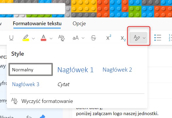
- Use headings and styles in longer emails - in the browser version of MS Outlook Office you will find this in the top menu ‘Text Formatting’. Headings make the text clearer for the recipient and make it easier for screen reader users to determine the structure of the message. Heading 1 will only be used once, heading 2 can be used several times. It is a good idea to divide the information in the email into smaller portions and give each larger whole a corresponding heading.
- Use sans-serif fonts (e.g. Arial, Calibri).
- Avoid text in capital letters, italics or with underlining.
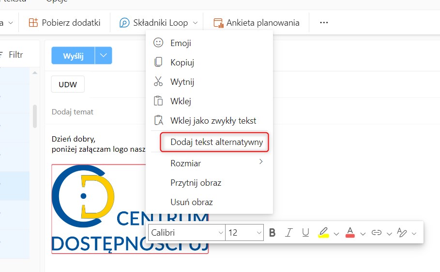
- Add alternative text to the graphic you are attaching, which can be done by right-clicking on the graphic and selecting ‘Add Alternative Text’. By providing concise information describing the visual element, persons who cannot see the screen will know what the graphic represents
- Avoid communicating relevant information in images only. If you use an image with text on it that is not in the body of the email, the text in the image should be repeated there. However, there is no point in duplicating content in the image and in the message.
- Avoid tables, present data in a different way as tables are unresponsive, and they scale and display poorly on different devices, in addition to being difficult to read for persons using screen readers.
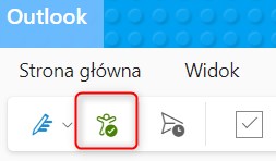
- Use the ‘Check Accessibility’ function - in the MS Outlook Office inbox in the browser version you will find it in the top menu ‘Options’, in the app - in the ‘Message’ menu. It is a tool that reviews the content of the email, highlights any problems and suggests how to solve them.
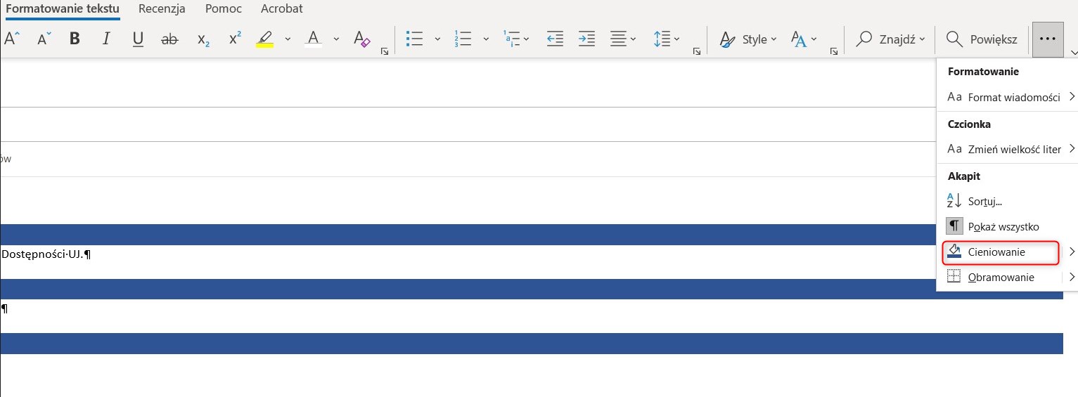
- Paragraph highlighting - an option only available in the application, in the browser version it is not possible to apply such highlighting. Paragraph highlights can be created using paragraphs - on the ‘Text Formatting’ tab in the Paragraph group, select Shading, and choose a suitable colour. This function can be useful when you want to graphically highlight a part of your message and when the email content is very large.
- If you are attaching a link to a film to your message, check whether the multimedia is subtitled and whether an audio description is needed for the material (it is necessary if the image has an educational value and this is not included in the soundtrack).
- Create clear labels for links. Names for links should be clear and related to the content they link to. Avoid the phrase ‘Click Here’, it is better to name the content you are linking to in a whole sentence.
- Take care about contrast.
- Use bullet lists, numbering built into your word processor.
- If you need to space sentences and paragraphs, do so using the options on the ‘Text Formatting’ tab in the ‘Paragraph’ group, instead of using blank spaces (created by Enter).
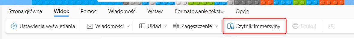
- Check the reading of the message by the immersive reader - in the browser version - View -> Immersive Reader, in the app - Message -> Immersive Reader
Źródło: